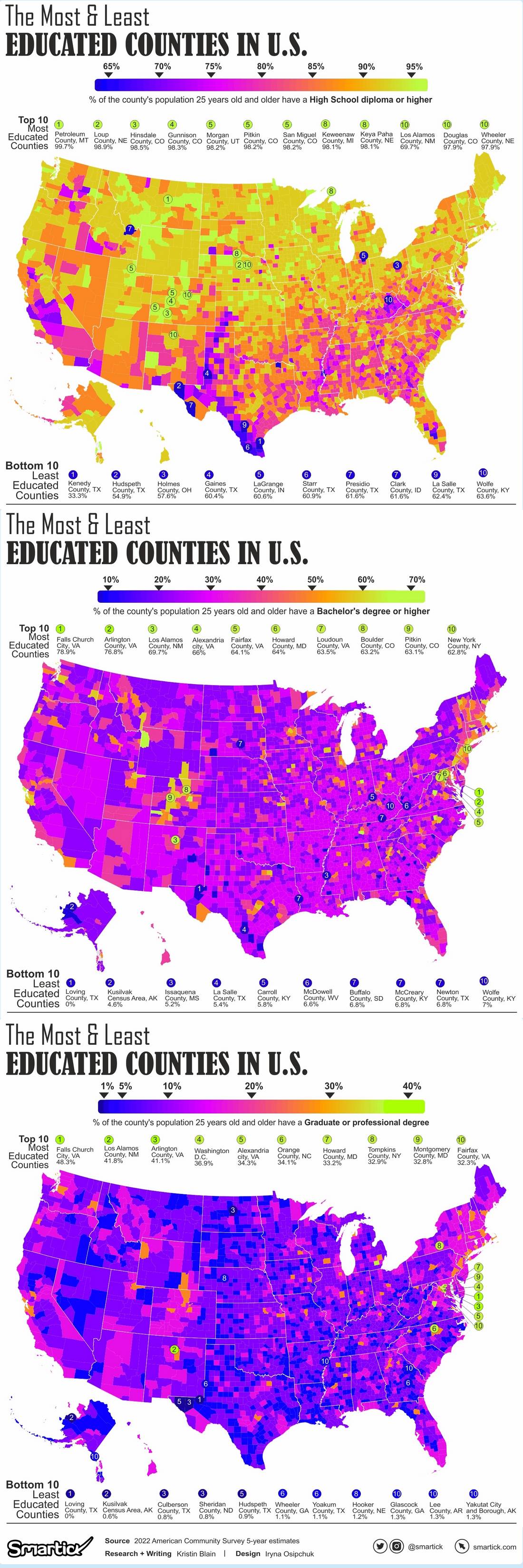
Neat data, but it seems like starting the coloring at 40% is really high.
I’m curious what this would look like if they counted counties with 25% and above degree requirements.
not really, that’s roughly the percentage for the entire population of the country.
Exactly. The less educated population matters just as much as the more educated. Those people are not represented in this map.
here’s all the counties by education attainment. high school, 4-year college, graduate/professional degree.
source of the visuals:
www.smartick.com/data/visualizing-the-most-and-least-educated-counties-in-america/using data from the census:
https://www.census.gov/data/developers/data-sets/acs-5year.html
Other than the obvious typo on the top chart, this is really interesting information.
Why would they be? The map is clearly not about that information. That would be a map titled “percent people 25+ WITHOUT a bachelor’s degree.”
And those are the people that the democrats ignored.
This is somewhat a “people live in cities” graph, but not as stark of one I expected. Not all big cities are so educated, plus there are a lot of rural places that draw in a surprising number of people with advanced degrees.
Still, I’m amused that Interstate 29 in specific lights up like a string of Christmas lights.
Based on the states I know, some of the surprising rural areas are where state universities are.
“People live in cities and get degrees in college towns” map.
I live in such a place. You’d think it would be a bluish county because of it, but it’s deeply red.
Oklahoma only has 1 county lit up, and it’s where a state university is, OSU. But it’s ranked lower nationally than OU (#196 vs #132). Both are in otherwise small towns, basically overrun by their respective colleges. Anecdotally, Norman (OU) is known to have nothing in town, but Stillwater (OSU) has it’s own subculture and town pride.
I’m curious how many of these counties just contain college towns vs how many actually might attract highly educated people.
Norman is effectively a suburb of OKC. Also it’s by county so all the stuff actually closer to OKC will out weigh the college town there.
It does appear to be mostly college towns and some high education cities though
Yeah. It is interesting that Los Angeles, Las Vegas, Phoenix, and Miami aren’t on here while Salt Lake City, Denver, and Atlanta are very visible.
Denver vs Vegas and LA isn’t surprising. Cities built on industries that don’t require education won’t be massively educated
Yeah, interesting that Colorado has the highest density of 60+% is it all expats of the Midwest who don’t want to move too far away?
Actually because it’s in percentages it could be small towns run by one large industry that requires degrees.
I assume a lot of defense stuff air force academy, NORAD, space force…
Doesn’t hurt that a lot of people who have visited end up coming back to stay. Colorado is pretty great place to live.
I’ve spent most of my time in southern Colorado which is alright but central/northern is stunning…it’s almost like if oregon or Washington were landlocked.
The county south of Nashville is basically the Nashville suburbs, with a serious legacy of redlining.
Whycome the south doesn’t has orange boxes? Is we stupid?
Yes you does
No I ain’t
NC and TN have some. But we often is.
TN is Williamson County. Which is basically the Nashville suburbs and/or bougie town.
Also, not a whole lot of actual locals living there, ask me how I know.
I mean, for NC it’s the Durham/Raleigh suburbs plus Duke University, so plenty of out of staters (seriously, just go to Duke gardens on a weekend, it’s pretty amazing how many languages are spoken). Which would probably explain a lot of it.
Eeeyup. I done good at readin, ritin, and rithmetic, but then they got ritin in thuh rithmetic and it all went ta hell. I’m plenty smart without that book learnin anyway.
One can see the impact of the Yellowstone national park quite clearly.
Same with Los Alamos Labs in NM. That orange spot has more PhDs per Capita than anywhere else in the states.
Cambridge, Massachusetts might be its rival
I was wondering what that was.
I want to see the map with 20-30 and 30-40 too!
I want to see a map with % of high school equivalency.
I am part of the original map though, I only have an associates
If you are wondering what that red spot in Wyoming ans adjacent green in Idaho is, they are the Teton counties (one on each state).
Nah, Teton County is easy to understand although I do question how they have a higher percentage than Albany County. What I’m really wondering about though is that orange county in South Western Colorado. WTF is that about?
San Miguel County. There isn’t too much there, but it does have Telluride, a very posh ski town. If I had to guess, I would say the less-educated staff (hotel housekeeping, restaurant servers, lift operators, etc) are only there seasonally but business owners/managers and maybe some remote workers are there permanently, skewing things a bit?
I would LOVE to see a better answer than mine!
I’m pretty sure this is the answer. That county is super sparsely populated, outside of Telluride. Telluride is a mini Aspen, so is populated by wealthy (and thus usually educated) people.
I live near Indianapolis.
You wouldn’t now it.
Edit: Ironically, I made a spelling typo. Sigh.
It appears that the red county is Hamilton County, not Marion County.
Could be. Hard to tell when it’s that small. Still doubtful.
In 1911, the Hoosier State House came within one vote of rounding ‘k’ off to backspace.
Dang CO, you smart sexy bastard.
Mississippi making Arkansas and Louisiana look bad.
Damn, Arizona and Utah. What happened to you?
And Arkansas and Louisiana. They’re all in the South, no surprise there. :/
I looked to the south first and somehow missed those two. And absolutely no surprise about these two.
Ah, no worries. Funnily enough I did the same but on the East side and then saw your comment. Lmao
I see you, Los Alamos.
Let me guess the red in Indiana contains Purdue and Bloomington
Neither I believe it’s Hamilton County, the (comparatively) rich suburb of Indianapolis.
Those are the green counties actually.
Huh, then I’m baffled unless it’s rose hullman
Ah. That’s why.
Counties with colleges have a higher amount of college degrees, neat
Why only count people older than 25?
Because otherwise the data would be artificially lower in areas with more children.
For example, imagine a suburb in Utah filled with college educated software engineers with big Mormon families. If you count the kids, it might look like people there don’t have degrees.
Doesn’t a bachelor’s take 4-5 years, with people starting around 18-19? I guess we’re only talking about a year or two so the higher age is to help cut down on the noise (doubt there’s many people with bachelor’s dying before 25 to skew the results)
Below 25 it depends on how fast you finish your studies whether you own a bachelor’s degree yet or not.
It filters out college towns with large masters and doctorate programs.
That’s a good point, need to control for students. Wouldn’t 25 year olds still be in school for their doctorates though?
Wouldn’t 25 year olds still be in school for their doctorates though?
Yes, I think that’s the point — they skew the numbers upwards.
21-22 is the average age to complete a bachelor’s degree, so I’d guess - other than eliminating children, who couldn’t possibly have gotten degrees yet - just evening out the data a bit to account for later starters or longer programs? They probably had a target 90% of degree-receivers or something like that
Because my toddler shouldn’t affect this map


