

You must log in or register to comment.
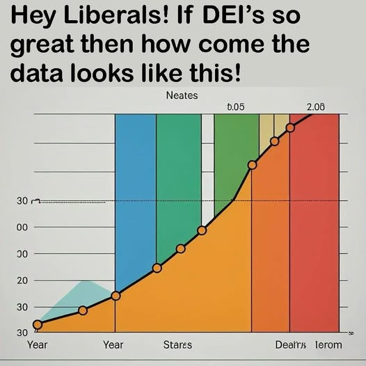
I immediately went to the y-axis to see how they normalized it, only to find well there really isn’t much of a y-axis.
Yes this makes sense, the 20 below the lower 00 above 30 at the point of year is illuminating! Compared to stares, where it’s above the lower 00 already! At and after the unnamed point before deal’s we just let you guess the value, which makes perfect sense. It’s Neates after all. You can use the 0.05 as a hint!
This chart has too many colors.
Gay.
What even is this supposed to represent?
Looks like somebody asked an LLM to generate a bullshit graph…
What may be its optimal application!
can’t even be bothered to open excel and whip up a graph in 2 minutes
instead we get AI slop
that’s just regular fox news chart
Ah, yes, I see the Year to Ierom ratio is heavily stacked in the Ierom end.
Nice AI graph.
Like what? AI-generated?
Presumably the joke is that all “data” republicans use to prove DEI is harmful is actually fabricated. Lazily.
The trend is good because it goes up and like a right hand gesture. Graphs that go like the left hand are inefficient.
- Elon.
We’ve had one year yes but what about second year?
I don’t think Elon knows about second year.
Neates!


