

You must log in or register to comment.
Well now I need a tool that makes graphs like this. I think I smell a winter break project coming up
Please do. I really like this chart and expect a lot more coming soon.
And no, I don’t expect to get any actual data from the chart at all.
What’s the problem? What I’m seeing, these are absolutely valid SQL joins 🤔
😂
Get that fancy database stuff outta here. In science, we either do Excel or we do nothing at all!
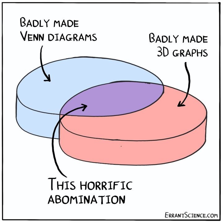
What about 3D Venn diagrams, but the sets are spheres?
Venn diagrams, but the sets represent whatever the diagram is about (like houses for housing markets).
So something like this? I love that idea!
I think for maximum uselessness, they should not be overlapping spheres, but deform at the interface, like soap bubbles or rubber balls. As long as the spheres are the same size and modelled with the same “surface tension” or “elasticity”, the “intersection” of two sets would then be a circular interface with an area proportional to what would otherwise be an overlap (I think). If the spheres have different sizes or are modelled with different surface tension or elasticity, one would “intrude” into the other.
Multiple sets would have increasingly complex shapes that may or not also create volumes external to the deformed spheres but still surrounded by the various interfaces.
Time to break out the mathematics of bubbles and foam. This data ain’t gonna obscure itself!
Might there actually be utility to something like this? Scrunch the spheres together but make invisible everything that is not an interface and label the faces accordingly. I suppose the same could be said of the shape described by overlapping. (Jesus, you’d think I was high or something. Just riffing.)
Volumetric Herbert space diagram.
Why limit it to 3 dimensions?
Why limit it to an integer number of dimensions?
Because I’m not sure how to make it work in non integer dimensions.
How about 4D Venn diagrams?
One might even go as far as 5D
When I read your comment, my monocle popped right off!
At least the “depth” is consistent
it’s not that bad tbh
We need different heights for each colour. Then the middle colour can be an average.
i like big graphs and i can not lie
all about that x and y
though when the venn diagram seems to deny
an z axis I sigh
I never really understood these graphs, even with the best of my ability. I just think it’s an excuse for people to make vaginal references.
deleted by creator


