
Either that or a down arrow into a manilla folder. Another item that is nearly obsolete.
Nero burning program used an icon of the colosseum on fire to represent their burn button.
I see no issue with using a floppy disk.
That’s wasn’t just a disc….?
Nero - burning ROM
🤷♂️
Wow… I never made that connection. I feel stupid AF.
Yeah the program, but buddy said the burn BUTTON, that’s a flaming disc for a play on that pun too.
Two different icons, and OP specified the wrong one.


That’s the program, the burn button ITSELF is a flaming Disc.
Man, Nero’s designs were so gaudy, i miss them
The pointer icon is an arrowhead, ~74000 years old. I don’t want to hear people complaining about how old the floppy disk is.
It’s similar to an arrowhead, but is it actually an arrowhead? Or is it just an arrow?
Missing the shaft and fletching.
nuh uh, mine’s a banana. 🍌
#justMicrosoftPlus!ForWindows95things
Not a d scimmy?
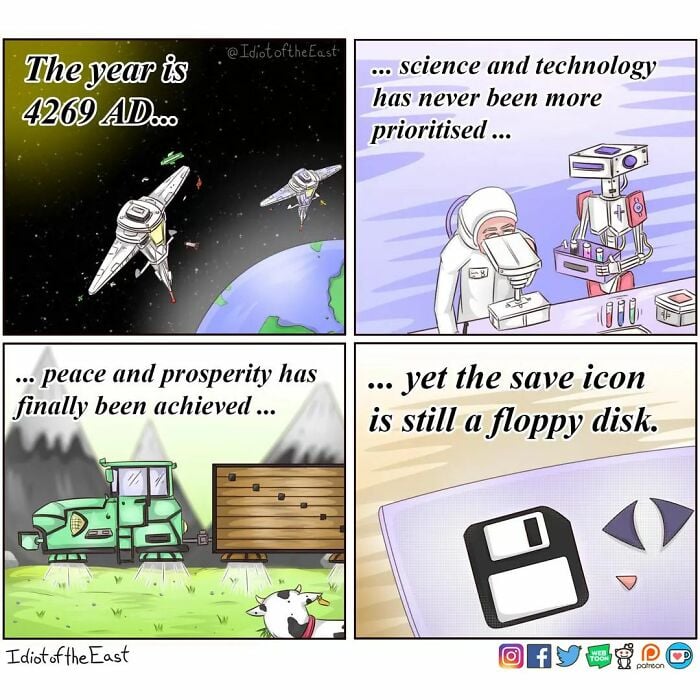
The idea that human society will make it to 4269 as well as the old Twitter logo at the bottom really dates this one. 😥
People probably said similar at the fall of every empire throughout history. People will endure and build anew. Life finds a way.
Most other empires didn’t have the ability to destroy the ecosphere of the planet they lived on.
The modern empires can do it not just on purpose using nuclear weapons, but also accidentally through climate change.
Life will find a way, but will civilization? And will the dominant species still be humans?
Yep. And yep.
Planet will be fine and livable. It will be different, but livable. Even most nuclear war scenarios will not destroy everything, just most populated areas by now.
Liveable, maybe. But, maybe miserable. Like, the planet was liveable for hunter-gatherers during the ice age, but lives were short and brutal. We could be headed back in that direction.
Does any of that matter to the planet? Like any of the ancient plants and critters that have come and gone, humans will have their time and then pass from existence and memory. Something new and different will replace us.
Such is evolution.
Does any of that matter to the solar system? I mean, one of the planets has some molecules that combine in complex ways. Big deal.
No it does not. Nor does the universe bother about galaxies. The point is that all things that exist have their time under the sun and then pass so something new and different can take it’s place.
It’s huberous of the highest order to think everything will continue on as it is right now, And to try and preserve it all for your personal comfort.
“Huberous”?
It’s unlikely that people will go extinct, but we’re perfectly capable of creating a Mad Max or Fallout type of world.
I like it. It’s universally recognisable, you know what it means and what it does.
It’s only universally recognized because of precedent. The true challenge is to create something that can be understood by someone that has no background with computers (or whatever)
Like the radiation ☢️ thing, danger ⚠️ , are supposed to be examples of this. Radiation more so because it’s not supposed to rely on language even
Now excuse me while I press the call button on my phone which is shaped like a landline handset from 30 years ago
For sure, but it doesn’t actually matter whether it’s abstract from the outset or has become abstract through technological advance so long as it’s unique and understood. Someone who’s never seen a floppy disk will still learn it quickly, because it’s distinctive.
But what if we go extinct and computers remain functional? will aliens that discover our planet be able to save their documents? Did you think about that??
I’ve said it
oncezero times and I’ll say it again. Far-future hypothetical space aliens should RTFM.
.not_porn
Looks like a Switch cartridge as well, so no, that’s gonna be lost soon.
By that argument, it looks like an SD card.
I’d argue that the
insanely satisfying stim toyshutter of the floppy keeps it unique, though.
How is the nuclear sign in any way universally understandable? It is properly by learning it’s meaning.
It’s intended to visually represent an atom with radiation emitting away from it.
It’s not “univeral” in the sense that anyone could understand it, but in the sense that anyone who knows about what radiation is would have a clue - be them people now, or some far-future civilisation stumbling across a nuclear dump site, or aliens. It’s a depiction of what is going on.
The symbol also uses elements of graphic design that make it feel unwelcoming and hostile even if you have no understanding at all. It’s a design that clearly telegraphs “this is not a good thing”
Similar for the biohazard sign, which in its strange curves and spines looks almost “mutated”
I respect all the science and research in hostile design, but then I rember the chilli peppers, just trying to keep safe from mamals by simulating the feeling of fire in their mouths…
Evolution doesn’t really work that way though. Peppers didn’t evolve spiciness to keep animals away, they essentially randomly developed a mutation that made them unpalatable to most animals, and that increased their odds of survival. It’s not doing X for Y reason, it’s X happening with Y as a consequence.
The design process is actually very interesting to read about and the intentionality (whether you think it’s effective or not) is essentially the scenario that if someone were to stumble across it in 10,000 years they would recognize it is dangerous and leave it alone
That said you are probably right given there already have been a few notable incidents where people have broken into discarded medical equipment and stolen radioactive sources, poisoning dozens of people in the process
You can make calls on your phone. I gotta text my friends this
It’s interesting how that precedent happened though.
30 years ago saving something basically involved taking a floppy, putting it into the floppy drive, and then hitting a “save” button. That was often because computers didn’t even have a hard drive. And, when they did have a hard drive, having your files on a floppy drive was basically the only way to get them onto another computer. So, because of that, a floppy drive was pretty universally recognized as a place where you saved files.
In the time since then, saving to a hard drive became more common. But, it’s hard to use a hard drive as an image for “save” because only computer geeks know what a hard drive actually looks like. Even if you could get people to recognize a hard drive icon it’s also ambiguous because you use your hard drive for many other things other than saving. Finally, it’s also less necessary to put the save files on external media, because you can email them, upload them, save to the cloud, etc.
The only physical media where people still save things is USB thumb drives. So, you could put in an image of a USB thumb drive, which more people would recognize, but that’s more ambiguous because people only save files to a thumb drive in certain specific cases. It’s also harder because there’s not really a globally recognized thumb drive image. All floppy drives had to look more or less identical because of the constraints of the disk drive system. But, USB drives only have to have the USB part in common – and in some cases that’s hideable or retractable.
There’s KDE software (might be a Linux-wide thing, idk) that changed it to a down arrow pointing to a rectangle. I don’t like it. I really don’t fucking like it.
Me neither, it looks like it should mean “download”.
Those icons probably come from the default breeze dataset
ThatsANoformeDawg.jpg
Got me real curious. What app? Care to share a screenshot?
Here are the icons in the default text editor in Mint Cinnamon. Save is the third from the left (the first 2 are New and Open).
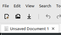
I wouldn’t peg that as the save. It looks like a download button. I get it within the context of skumorphism, but that down arrow icon already pretty universally means download.
That’s ugly af, and first time I’ve seen it.
I don’t think it’s “ugly”, but the first time I used that editor (with the new icons, that is–it used to have the traditional icons) I was like “Where’s the damn Save button?” I had to hover over them to get the tooltips so I could tell. The Open button is just as bad–it looks like it would be Print!
It may not be aesthetically displeasing, but functionally so.
That screenshot looks disgusting. Unsharp font, irritating icons, weird fontset. Is that GNOME and/or Ubuntu? Terrible.
That’s not true, this is the current version on Arch and it’s a floppy.
Huh, interesting. It’s probably my icon theme, then. I’ll check when I get a chance.
My Fedora KDE native applications do. But downloaded software still uses the floppy icon if those developers want to.
The Floppy Disk is Computer Jesus. They both died to become the universal symbol of salvation. ;)
You can still buy new 3 1/2" disks. And usb connected drives are available to read and write them. So they ain’t dead.
But I do pour one out for the 5 1/4". The OG of common portable storage. It was the floppist of the floppies.
OG was the even larger physically / smaller data storage 8" floppy

I have seen the 8" floppys but never used one. I did use and have a fair collection of 5 1/4" for a good number of years. And I cursed the 3 1/2" floppies for their short, yet brutal lifespan. I can remember installing Windows 3.11 and AutoCAD 9 with a stacks of those accursed things. And daily backups for the bookkeeper were constant headache until we got a tape drive.
There’s some additional nostalgia attached to calling them with the simple fractions as opposed to the decimal ones, even if they mean the same thing. HDDs for example are still around and I’ve always seen their form factor as 3.5", not 3 1/2".
Don’t think I’ve ever heard anyone say three point five" HDDS or read it in the decimal form-- Three and 5 tenths. It’s always said as the fractional form-- 3 1/2".
I think they mark them as 3.5" because it’s easier to typeset a decimal than fractions. Even those accursed 3 1/2" floppys seem to be marked 3.5" these days.
My favourite are the kids excited that their mom 3D printed the save icon when she showed them a floppy disk.
Which never happens yet everyone repeats it as if it’s a common occurrence.
I like the joke, but let’s not pretend this is something that happens.
The call button is the handset of a landline. Emails are represented with envelopes. Camera apps have DSLR cameras on them. Folders/Directories look like the ones belonging in filing cabinets. The settings are a cog wheel…
These are the religious iconography that future anthropologists will ponder over.
The various symbols found on audio and visual media comes from tape reel machines. Specifically the right arrow Play button only makes sense in relation to tape movement, yet we use it for just about any format to begin play.
Timelines also progress from left to right, so that one holds up
In cultures with a left-to-right writing system
Oh really? I never thought of that. Interesting!
My wife coaches high school field hockey. She told me how one day she overheard them talking about how one of them lost their work on a homework document and had to start over.
One of the girls said “you just gotta get in the habit of clicking the blue square”, which the others were confirming is the thing to do. So then my wife asks “blue square, what do you mean” and another clarified “the save button”.
They had no idea what a floppy disc was
I had to explain the save button to my 9 year old about a week ago. And then I found myself explaining what a floppy disk was. Tonight I’ll ask him if he knows what that is a picture of. I’ll be impressed if he remembers. If he fails the check, imma gonna launch into a lecture on boot disks, games, and batch files. Wish me luck!
Teach him how to manually specify his interrupts and to tune his extended RAM so he can play games.
After he masters that, get him an MFM or RLL hard drive and teach him to low level format it and set the best interleave.
I’d be surprised if using these kinds of point-and-click GUIs was still common in 2244 years, as opposed to some kind of language- or thought processing. Then again, people are still writing with pen and paper sometimes, despite all the digital advances.
Pen and paper is still the superior way to make your first draft and anyone who disagrees is wrong.
I hate hand writing and drawing.
My drafts are computer aided.But in case of emergency, I have muscle memory.
Do you imagine how wonderful Lemme could be if everyone drafted theirs posts on paper, prior to clicking “Send”?
Well, pen & paper was modern 2 kya.
I’ve seen a growing number of programs that use an arrow pointing towards a picture of a computer or hard drive for "save* and an arrow pointing away from it for “load” and I feel like that’s very graceful skeuomorph to shift to that might hold up for longer (although it breaks if it’s talking about cloud save, but replace the picture of a computer with picture of a cloud and you’re back in business I suppose)
I’ve seen those being used as download and upload but not for saving.
I want to say the game Soviet Republic Workers and Resources uses the exact iconography I described including for cloud savings vs locally but I could be misremembering
Downloading is a type of saving
Skeuomorphism is the word your looking for, its why your digital cameras still make a mechanical click sound even through there isnt a mechanical shutter
Maybe, just maybe, someday it gets updated to an SD Card.


